

Perfect Colour Palette: 14 Designer Tricks to help you pick your colours
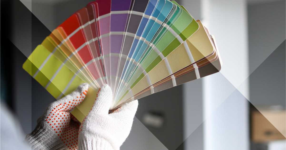
Pick a Colour, Any Colour…
Picking the perfect colour palette for your interiors is easy with our palette-perfecting tips. We explain the colour rules that designers follow and make it a snap to put them to work in your home.
-
Choose a Perfect Colour Palette Scheme From the Largest Pattern in the Space:
If you’ve got patterned upholstery, a colourful rug or large piece of artwork, pluck colours you like from the pattern. For a neutral wall paint colour, look to the pattern’s whites and beiges.
-
Decorate From Dark to Light, Vertically:
“A real “cookbook” way to make any space look good without much risk,” says designer Mark McCauley. Use darker colour values for the floor, medium colour values for the walls and light values for the ceiling. “Any interior space replicates the outside world,” he says. “The exterior environment is generally darker below our feet (the earth itself), medium-valued as you look straight ahead (buildings/trees) and lighter skyward.”
-
Start With the Formal Areas of the House:
Specifically, the living room, dining room and entry way. Choose a colour scheme for those areas first, then pull one colour from the scheme. For example, take the red sofa and tone it down (say, to burgundy) for an accent in more private spaces such as the den, office or bedroom.
-
Use the Colour Wheel:
In general, analogous colour schemes are more casual and relaxing, and work best in informal or private space. These are colours next to each other on the colour wheel, such as blue and green. This is a good strategy for a bedroom, where you want to rest and recover.
-
Take a Cue From Your Clothes:
Most people buy clothes in colours they like to wear and they look good in. Similarly, you should dress your rooms in colours that flatter you. If denim is your go-to, consider a navy sofa. Or if you look (and feel!) perkiest in bright yellows, try mixing in a few citrusy accents with pillows or accessories.
-
Back to Black:
Designer Mark McCauley advises adding a bit of black in every room. “The black clarifies the rest of the room’s colours,” he says. For a small pop, try a black lampshade or a black vase. For bigger impact, paint your kitchen’s base cabinets in the high-drama hue.
-
Go With Grays:
Put today’s trendiest neutral, gray, to work in any style interior. Gray’s chameleon-like quality allows the colour to appear either warm or cool. Also, it pairs beautifully with both pastels or kicky colours like hot pink, Kelly green or citrusy shades.
-
Use the Rule of 60-30-10:
“When decorating a space, divide the colours into components of 60 percent of a dominant colour (walls), 30 percent of a secondary colour (upholstery) and 10 percent of an accent colour (accessories),” advises designer Mark McCauley. “Works every time!” he says. “This ratio ensures that the colours are properly balanced and there’s just enough pop for interest.”
-
Make Small Spaces Pop:
If you have a small room in your house, don’t paint it white to make it seem bigger. Instead, give it more oomph with a look-at-me colour choice. Let your big rooms expand with light, and your small rooms envelop you.
-
Contrast Warm and Cool:
Neutrals need never be boring. Pair cool gray with warm honey-coloured shades. The overall effect is restful. While contrasting these two opposites creates just enough tension to wake up the otherwise sleepy space.
-
Rely on a Timeless Pairing:
Always chic, black + white is one dynamic duo that never goes out of style. Accent the two colours with just a bit of metallic gold. It’s all you need to create a compelling colour story.
-
Rock a Monochromatic Look:
Shine the spotlight on your favourite colour by filling a small space, like a bathroom, with just that hue. Create a cheery master bathroom featuring the a bright colour, like Kelly green. Balance it with white walls and floors, The saturated shade is eye-catching but not overpowering.
-
Follow the Rule of Three:
Limiting your palette to just three colours is a can’t-miss strategy in any space. Mix saturated shades of sunny yellow, navy blue and grass green for a fresh, preppy and always on-trend look.
-
Showcase Your Personal Style:
If you decorate honestly, other people will appreciate it because it’s you. Even if they’d never decorate their own house in the same way. That means if you want to make every room in your house red, white and blue, go for it. You can make any colour look good as long as it truly suits your personal style.
Tips courtesy of https://www.hgtv.com/
Let us assist you with our expertise and knowledge
We are fully equipped to assist you with your building painting requirements.
Visit https://curasure.co.za/ for more information or call 011 675 2595 to speak to one of our experts.